BRAND IDENTITY, WEB DESIGN
TWIG Gardens
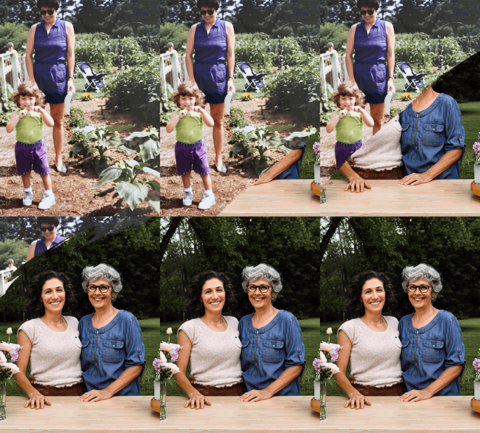
TWIG has one mission: Create floral and garden masterpieces by practicing resourceful and purposeful floriculture. Mindy and Carly have grown their own company into one of the most reliable, resourceful, and unique florists in West Chester, PA. The mother-and-daughter team have spent the past six years creating partnerships with local flower farmers and nurseries, and they are fortunate enough to work with some of the wisest and kindest local business owners in the borough of West Chester.
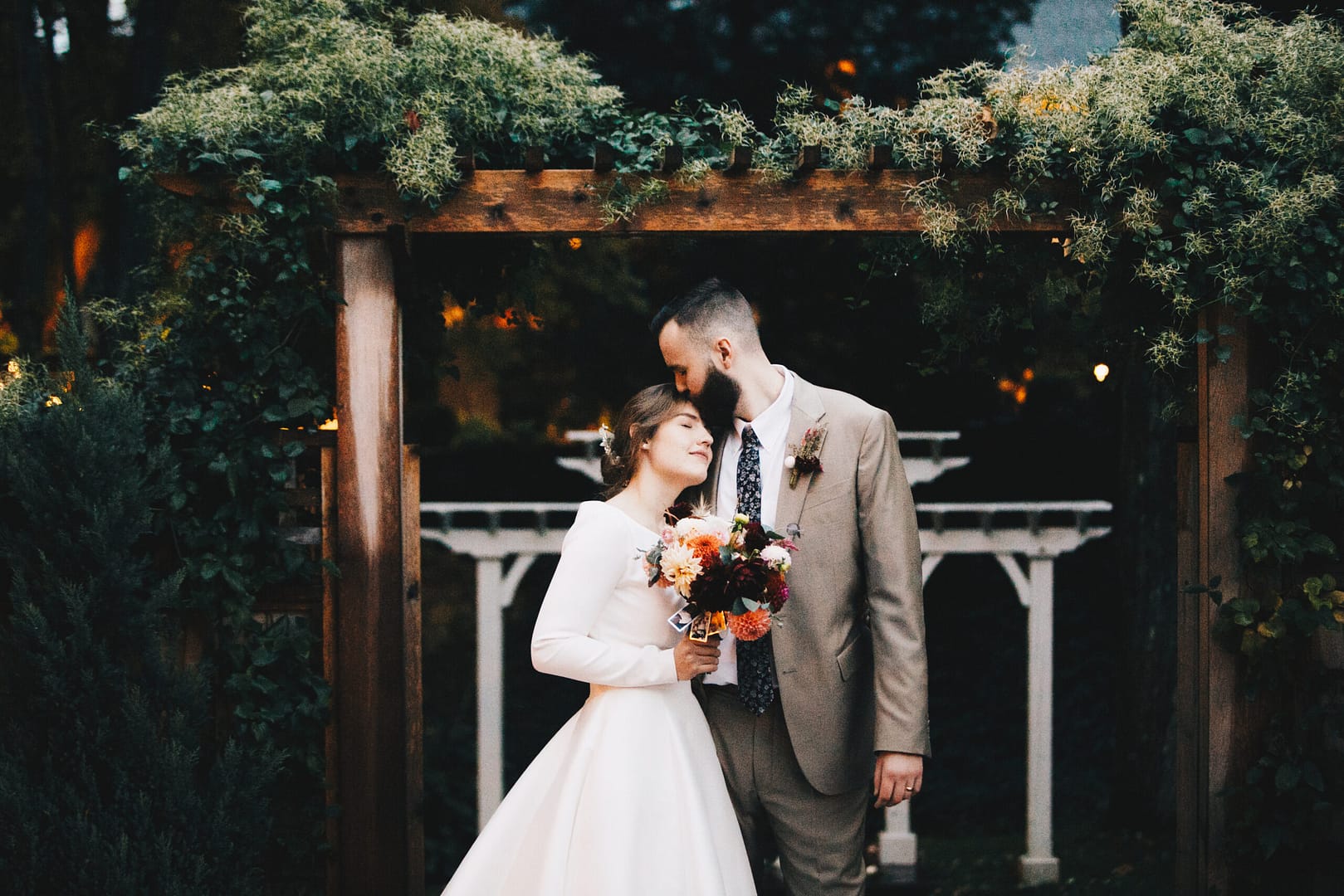
Since TWIG strives for craftsmanship, sustainability, and creativity, the branding needed to fit with in their vision and mission. It was important to have branding that felt elegant yet approachable. Something that could also work in conjunction with the beautiful photographs of their work.
Custom Logotype
Branded Iconography
Web Design


Deep Roots + Beautiful Growth
TWIG is run by a mother/daughter duo who have forged deep relationships with the West Chester and surrounding area’s local farms. Through these community relationships, TWIG is able to create beautiful and elegant masterpieces while focusing on earth-friendly & sustainable practices. The brand design needed to have a homegrown feel while still coming across as elegant and refined.
From the custom wordmark to the illustrated iconography to the intricate patterns, the brand utilizes organic elements with a polished beauty to keep things feeling natural yet upscale. This duality was important to TWIG as they work in the high end wedding industry but approach things from a more local and sustainable mindset. Trust us when we say the end result feels just as high end as a Pinterest board of florals.


TYPOGRAPHY & COLOR PALETTE
Inspired by the organic beauty of Art Nouveau
A custom type treatment was created to have the perfect mix of elegance and whimsy. Delicate, organic line intertwine to create the TWIG wordmark, with a more modern take on Art Nouveau applied for the brand iconography and imagery. Colors are taken directly from the florals that are worked with to create a holistically elegant yet natural feel.


WEB DESIGN
Navigating Floral Beauty
Drawing inspiration from the enchanting world of weddings and floral arrangements, we designed a website that exudes elegance and charm.
To create a sense of timeless beauty, we went for subtle layout inspired by the art of scrapbooking and collage. The website layout features thoughtfully placed overlapping elements, adding depth and visual interest. With these artistic touches, we maintained a clean and organized grid structure, ensuring effortless navigation and preventing overwhelming the visitors.
With the new website, TWIG can now provide an immersive online experience for their audience. Visitors can explore their stunning floral designs, discover wedding inspirations, and effortlessly connect with the team at TWIG to plan their dream wedding florals. Our website design aims to leave a lasting impression on visitors, reflecting the beauty and artistry that TWIG brings to every wedding celebration.
TYPOGRAPHY & COLOR PALETTE
Inspired by the organic beauty of Art Nouveau
A custom type treatment was created to have the perfect mix of elegance and whimsy. Delicate, organic line intertwine to create the TWIG wordmark, with a more modern take on Art Nouveau applied for the brand iconography and imagery. Colors are taken directly from the florals that are worked with to create a holistically elegant yet natural feel.


WEB DESIGN
Navigating Floral Beauty
Drawing inspiration from the enchanting world of weddings and floral arrangements, we designed a website that exudes elegance and charm.
To create a sense of timeless beauty, we went for subtle layout inspired by the art of scrapbooking and collage. The website layout features thoughtfully placed overlapping elements, adding depth and visual interest. With these artistic touches, we maintained a clean and organized grid structure, ensuring effortless navigation and preventing overwhelming the visitors.
With the new website, TWIG can now provide an immersive online experience for their audience. Visitors can explore their stunning floral designs, discover wedding inspirations, and effortlessly connect with the team at TWIG to plan their dream wedding florals. Our website design aims to leave a lasting impression on visitors, reflecting the beauty and artistry that TWIG brings to every wedding celebration.


