BRAND IDENTITY, COLLATERAL DESIGN
Japantown SLC Branding
This project stemmed from a design competition for 2019 AIGA SLC’s design week. Participating designers were randomly assigned a neighborhood from Salt Lake City and were supposed to create branding that reflected that specific area.
This design ended up winning 1st place in the competition as well as the March 2020 Pretzel Creative Award. We are currently in talks with the council of Japantown in order to see how we can actually apply this branding to the area.
Responsive Logo Suite
Custom Patterning
Collateral Design


NEIGHBORHOOD HISTORY
A close knit community of Japanese-Americans in the heart of downtown Salt Lake City.
Today, Salt Lake City’s Japantown is located on 100 S between 200 & 300 West. Originally founded in 1902, the area was larger and was home to Japanese businesses and thousands of residents. In 1964, the city approved a new, larger Salt Palace Convention Center, demolishing a lot of what was left of the area.
With further urbanization and development continuing to threaten what’s left of Salt Lake’s Japantown, we wanted to make sure the brand reflected the values and culture of the Japanese heritage, while modernizing it to show that it still has value and a place in our rapidly changing cityscape.

LOGO SYSTEM
Celebrating tradition with a little twist.
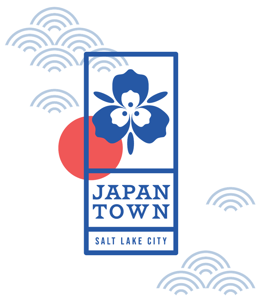
Drawing inspiration from the Hanko stamp that is used throughout Japanese culture from signing artworks to legal documents, the logo lock-ups are laid out to resemble these stamps. Both vertical and horizontal layouts were important as both are used in the Japanese language.
Use of the red circle is included on every logo mark. Sun imagery is often depicted in Japanese art and represents tradition and good fortune. While the typography can used in the logo set can be responsive from the full combination logo lockup up to just the kanji and “SLC”, the use of the red sun helps tie the logo variations together.
The imagery also drew on traditional Japanese icons like the cherry blossom and Mount Fuji, but was changed to encompass Salt Lake/Utahn icons, seen in the Sego Lily & Mount Olympus marks.


PATTERN PLAY
Custom patterning to ornament and elevate.
Patterning is a very common element in Japanese art, and it seemed like the perfect opportunity to create some branded patterns to be used throughout the visual identity. We studied traditional patterns and their uses/meanings, then selected the ones that felt like they embodied the Salt Lake Japanese Community and the atmosphere that we wanted the new Japantown to have; Good Interpersonal Relations, Prosperity, Tranquility, Growth & Health, and Longevity.


Getting community feedback for a better informed design.
It was important to consult, listen, and respond to the people who have ties to Japantown and the Japanese community in Salt Lake City. After researching the area, Japanese and Japanese-American culture, we presented a few options to members of the community. They had an opportunity to give us feedback, suggestions, and criticisms on the designs, to help inform a better brand that spoke to the people it was supposed to speak to and celebrate.
The first two concepts are shown above. After feedback that concept one felt too reminiscent of war time and propaganda, we proceeded with concept two, replacing the kanji-esque JT mark with something different, per more feedback from community members. Considering your target audience when designing visual identities is so important in creating beautiful, informed design, especially when it’s paying homage to a community or culture.


