BRAND IDENTITY, Package Design
High Mesa Chile Co.
High Mesa Chile Co. was created to celebrate and share the flavors of the American Southwest to people across the country. Working with small batch, flame-roasted chiles, their products are made with only the highest quality ingredients to ensure consistency, vibrancy, and the best damn flavor your taste buds have come across in a hot minute.
Because of their artisanal approach to their sauces and drink mixes, the branding needed to have the vibrancy of the flavors while still coming across as upscale; a fresh take on the Southwest aesthetic.
Custom Logotype
Branded Iconography
Merchandise Design
Package Design


Artisanal. Sharp. Reverent.
High Mesa Chile Co. wanted to pay homage to the lesser known landscapes Utah and New Mexico (think high deserts, plateaus, and mesas). This guided every aspect of the branding, from the dusky color palette to the diecut labels; we infused as much of the magic of the landscapes into the brand identity.
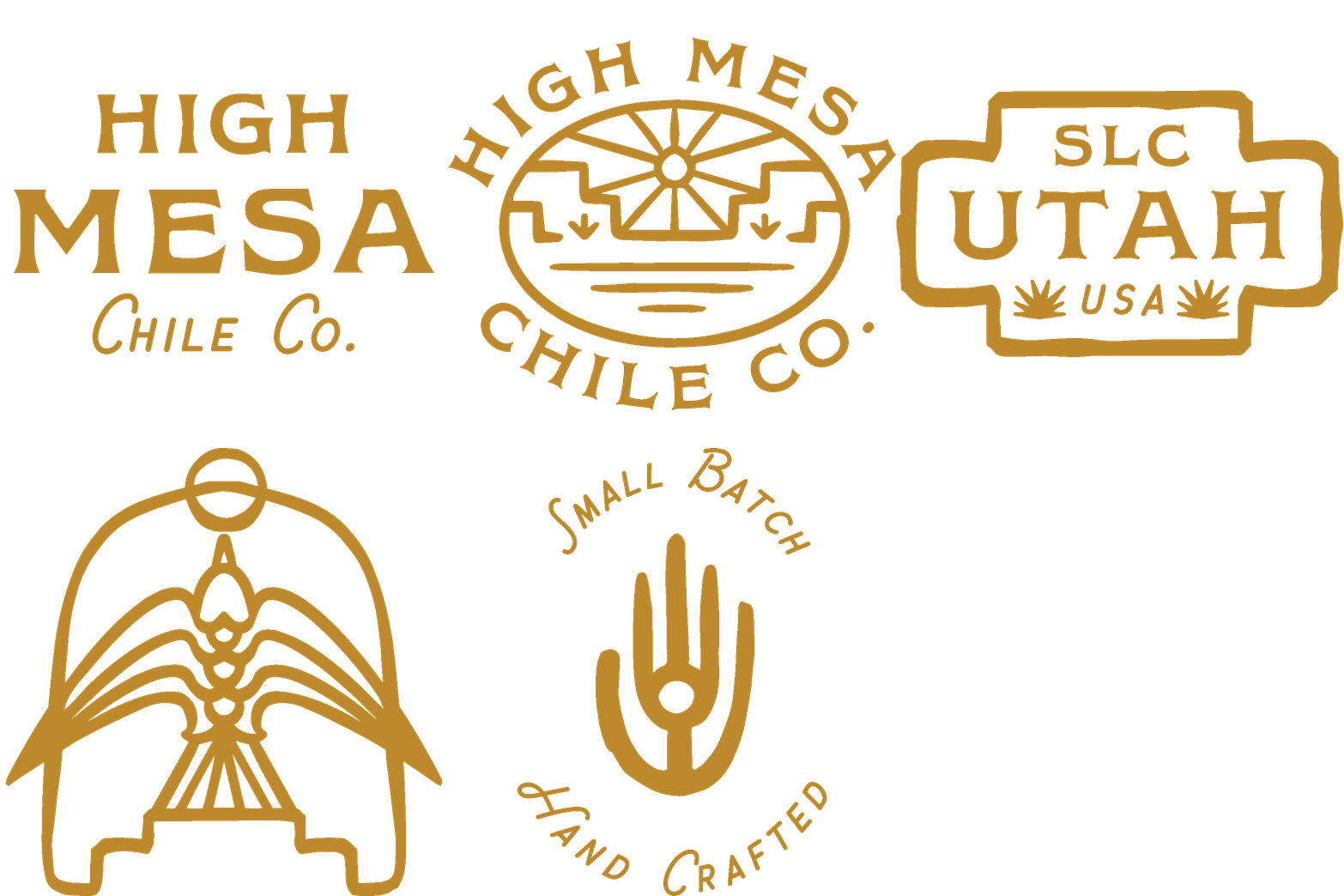
The main logo features a swallow (native to the region) atop a minimal mesa flying towards the sun. The mark is encased in an arched shape, alluding to the adobe style dwellings, with only the sharp wings breaking the border. The linework lends to a more detailed, higher end feel while still keeping the brand modern and clean. To bring in more artisanal elements, we created a suite of submarks and alternative logos to be used in various places, giving it that heritage feel.
TYPOGRAPHY & COLOR PALETTE
Inspiration from the Desert.
The logotype has bee customized from an upscale rustic serif, and has been paired with a more playful script. Pairing these two fonts gives off the same feeling at the logo does, clean and professional with handcrafted elements.
The color palette was inspired by the colors of the high desert and Utah’s colorful hardscapes. Taking from the dusty hues of the desert rocks, dusky sunset skies, sands, and sagebrush found throughout.


Packaging
Balancing the Bold and the Elegant.
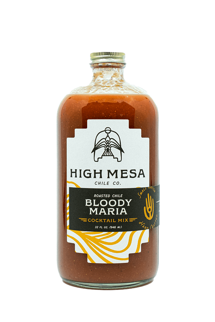
Our approach to the package design was to keep the refined, elegant southwest feel through custom dies for the labels that mimicked the negative space from the stair-stepped mesa in the logo. Using thick, textured stock brought a warmth and naturalness to the brand, and using layered elements helped drive home the small-batch, handcrafted feel.
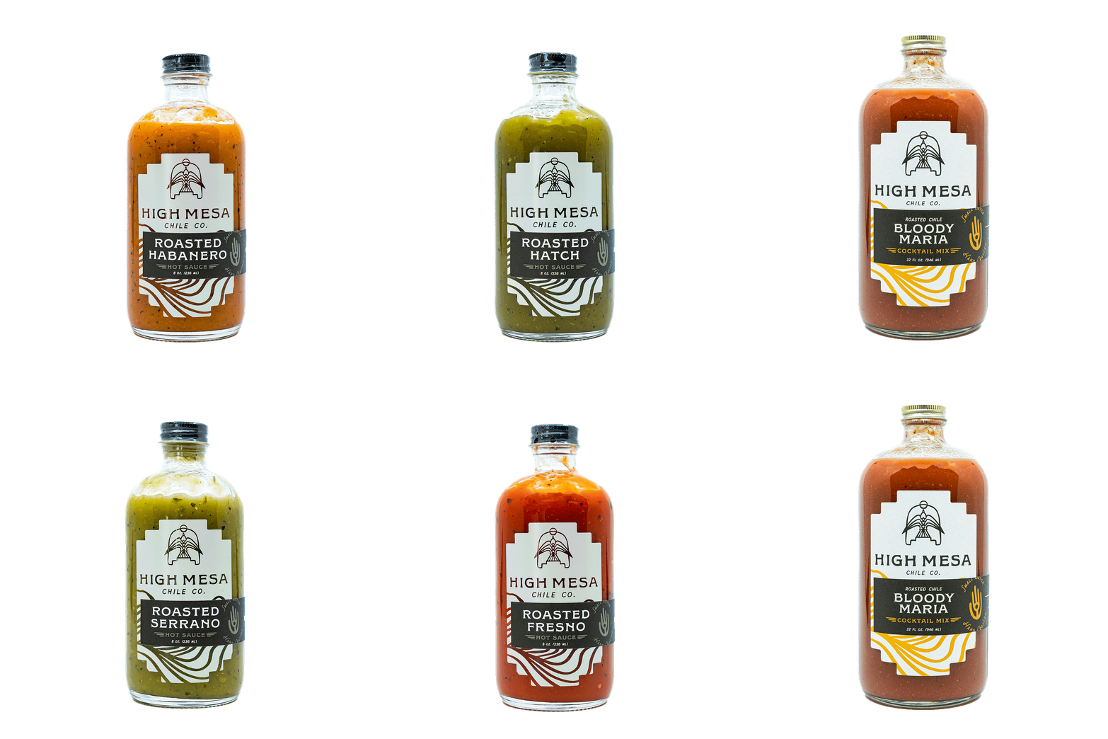
The smaller hot sauce bottles feature a screenprinted element with graphics knocked out to allow the product to show through, while the larger drink mix bottles use layered labels. Colors are kept to the warm black and off-white for the majority of the design with just a hint of an accenting color to help distinguish between product lines. A modern look with a little zest.


