BRAND IDENTITY
Hawai’i Wildfire Management Organization
Hawaii Wildfire Management Organization is a group aiming to help the people and places of Hawaii and the Pacific to be wildfire-safe and wildfire-ready. Their mission is to serve as a hub of wildfire prevention, mitigation, and planning activities in the Hawaii-Pacific region through proactive, collaborative, and forward-thinking projects.
HWMO is uses outreach, education and technical assistance, project implementation, and research to foster a proactive and collaborative wildfire prevention, mitigation and post-fire recovery in Hawaii and the Pacific. They work with scientists, non-profits, and local residents alike, so their branding needs to be able to speak to this wide range of audiences. It was important to keep a lot of the bright, cultural influences in the updated logo system, while still coming across as clean and professional.
Responsive Logo Suite
Template Design
Custom Patterning & Illustrations


Visual Journey
Modernizing
Hawaiian Spirit
A lot goes into the design process. It isn’t just one concept that looks good and is the “end-all-be-all.” Research and exploration are key to a variety of well put together options that fit the brands goals.
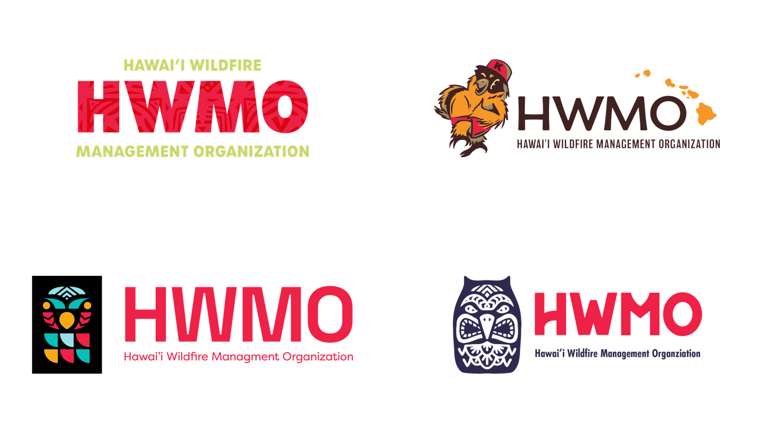
We came up with an array of concepts that displayed an adaptive and modular visual identity system for HWMO that is easy to uphold, implement and grow with the organization. Branding needed to appeal to both the public as well as peer-to-peer research organizations.

A look into the process
Creating Kapa Patterns
All good design is derived from research and meaning; it’s not just something that “looks good”. It comes from looking at the history of your audience, industry, or brand’s location. For this project, the cultural significance of the Hawaiian Islands and the people that have inhabited and protected the land for centuries was an obvious starting point. We dove into historical archives of the region, and came across an art form dating back centuries, kapa.
Drawing inspiration from the Hawaiian kapa, bark cloth made into textures, patterns, and colors, this branding has four custom motifs to use help designate the different pillars of the organization; Safety, Leadership, Stewardship & Knowledge. These four motifs then come together to create a brand pattern that is used in the main HWMO logo.
From research, to sketching and iterations, to finalized vector designs, this branding embodies a celebration of the bright Hawaiian culture.


A LOOK INTO THE PROCESS
Modern Kapa
Once the 4 kapa icons were chosen, patten play with various combos and colors was obvious. Patterning is a very common element in Hawaiian kapa so of course it was the perfect opportunity to include it in the branding. The iconography and designated use of color will help create an informational wayfinding system that allows audiences to quickly identify what pillar of the organization they are dealing with.


