
BRAND IDENTITY, Web Design
Wildlings Mountain Camp
Wildlings Mountain Camp is child care provider located in Park City, Utah that focuses on innovative & hands-on learning. Born from a need of a safe, inclusive, and progressive environment for children while their parents go about their day (or go skiing!), the brand needed to be warm and welcoming. The brand was built with handdrawn elements, a balance of bright and earthy colors, and playful illustrations. Our goal was to create visuals that would excite children and parents alike.
Responsive Logo Suite
Custom Illustrations
Web Design
Collateral Design

Responsive Logo System
Branding That Has Room to Grow
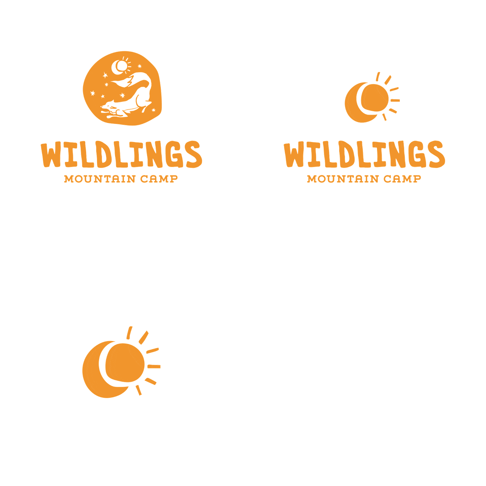
Wildlings Mountain Camp offers a variety of services from child care and after-school learning programs to summer camps. They wanted an identity that was flexible and responsive, and could grow to support all their different branches of business. The camp serves a range of ages, so creating a visual identity that appealed to younger and older kids alike was also a primary goal. From the main logo, elements can be pulled out and simplified down to fit a variety of use cases, like the moon and sun symbol for day and night care, the word mark for more professional settings, and the animals for different age groups in camps or schooling programs.

Color & Typography
A Balance of Bright and Natural
The typography combines a mixture of imperfect & organic fonts with a clean and legible body font to bring the authority and sense of security back to the branding. We wanted Wildlings to have a variety of letterforms to work with that allowed them to be as playful or professional as they wanted. The uneven edges of the heading font are mimicked in all of the brand illustrations with their imperfect, cut paper illustration style.
Color palette was created by combining vintage summer camp with mid-century vibes, resulting in a bright & poppy but still grounded and earthy array of colors. We wanted to stay away from the pastel-y neutrals that a lot of hip, child-centric brands are gravitating towards and make something that feels warm, welcoming and happy.

Website Design
A Little Bit of Fun on Every Page
With safety being at the forefront of the founder’s mind and mission, the website needed to be a resource for parents to visit in order to feel comfortable and confident with entrusting their children to Wildlings Mountain Camp. Clear navigation and user flow was important, as well as creative ways to display a lot of information regard procedures and protocols. Of course, we still wanted it to have the same warm and upbeat vibe that the branding has overall, so we settled on a layered, scrapbook approach and the result makes exploring the site just as fun as an afternoon at the camp.


